

Similarity
Similarity can be used to tie together elements that might not be right next to each other in a design.
In this case, both contact boxes are shaped and colored the same, therefore our brain will link them together.

Similarity
Similarity can be used to tie together elements that might not be right next to each other in a design.
In this case the log in boxes, although separated, they have an identical color, therefore the brain links them together.

Law of symmetry
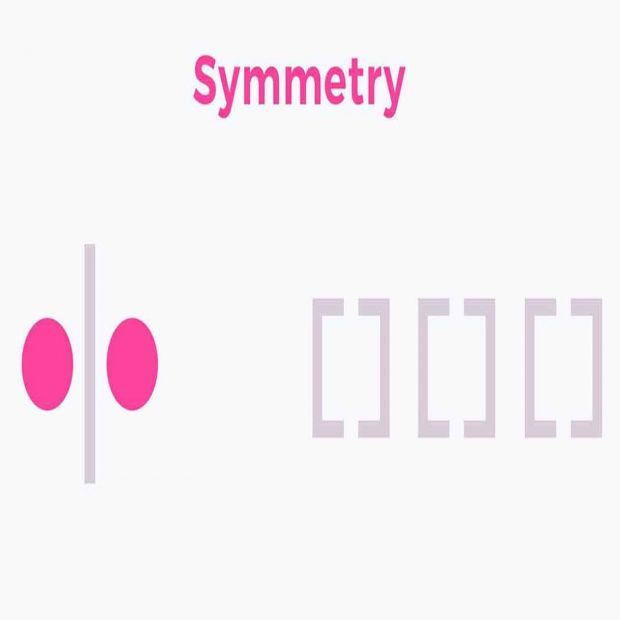
The law of symmetry, the 4 boxes are perfectly symmetrical next to each other, and our brain will therefore connect them as belonging together as one subject, in this case the number facts.

Proximity
Proximity refers to how close elements are to one another. The strongest proximity relationships are those between overlapping subjects, but just grouping objects into a single area can have a strong proximity effect.
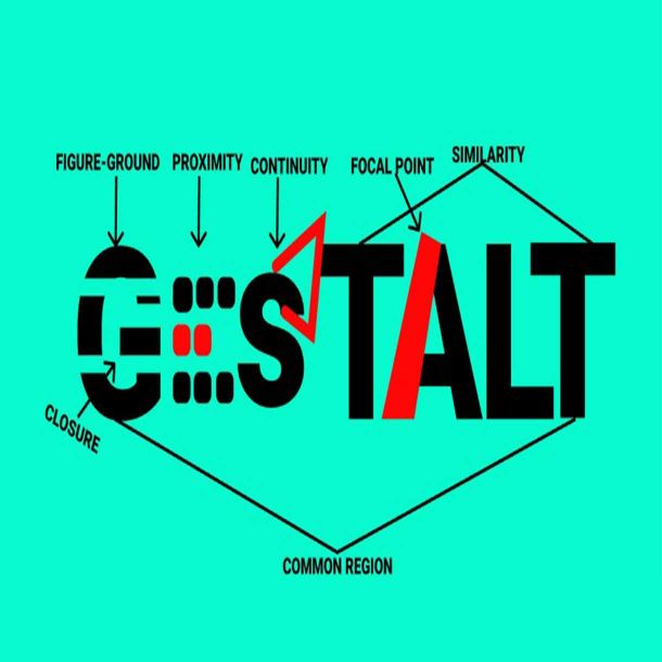
Exploring the Gestalt principles
One of the fundamental building blocks of Design, is the understanding of the Gestalt principles. Once one understands how the principles work, you can start applying it to make much more user friendly design, when for example working with User Interface. But the possibilities are endless, you can apply them to any kind of design, and elevate your work.
During this assignment we had to get familiar with the Gestalt principles, what they are, and how they work. Many of these your brain has always done without you realizing it, but now I learned the reasoning behind them. It was incredibly useful to learn these, and I will apply them in my future designs.

There are 6 principles
-
1.
Similarity
-
2.
Continuation
-
3.
Closure
-
4.
Proximity
-
5.
Figure/Ground
-
6.
Symmetry and Order

Similarity
It’s human nature to group things together. In gestalt, similar elements are visually grouped, regardless of their proximity to each other. They can be grouped by color, shape, or size. Similarity can be used to tie together elements that might not be right next to each other in a design.
Continuation
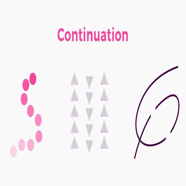
The law of continuation asserts that the human eye follows lines, curves, or a sequence of shapes in order to determine a relationship between design elements. The continuation can carry through both positive and negative spaces in designs.
Closure
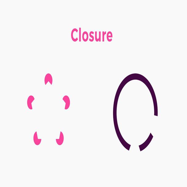
The principle of closure states that when we look at a complex arrangement of visual elements, we tend to look for a single, recognizable pattern. In other words, when you see an image that has missing parts, your brain will fill in the blanks and make a complete image so you can still recognize the pattern.
Proximity
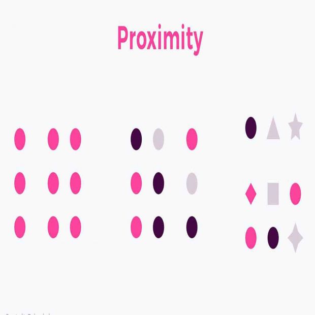
The principle of proximity states that things that are close together appear to be more related than things that are spaced farther apart. Proximity is so powerful that it overrides similarity of color, shape, and other factors that might differentiate a group of objects.
Figure/Ground
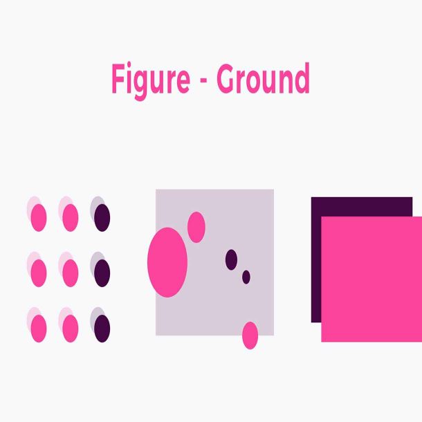
The figure-ground principle states that people instinctively perceive objects as either being in the foreground or the background. They either stand out prominently in the front (the figure) or recede into the back (the ground).
Symmetry & Order
The Law of Symmetry is the gestalt grouping law that states that elements that are symmetrical to each other tend to be perceived as a unified group. … This is a lawful statement of the role of symmetry in determining figure-ground perception.
What I learned
An incredible useful assignment where I was taught one of the fundamentals of good design. I´ll be looking back to this lesson very often, whenever I make a website design or a logo design.